Lecture Materials
1. Plotting basics#
Plotting is one of the basic tasks in everyday work of a physicist researcher and it is rare that a scientific publication has no plots. While it may sound trivial, it is important to maintain basic standards of quality in plots, which will be greatly appreciated by your collaborators and colleagues.
Here we present some basics of plotting in Python using matplotlib which will help you to start going if you have no prior experience.
Preliminaries#
Import matplotlib and (optionally) set your default styles (I prefer largish fonts/labels):
# Preliminaries: import matplotlib and set default styles
import matplotlib.pyplot as plt

# Default style parameters (feel free to modify as you see fit)
params = {'legend.fontsize': 'large',
         'axes.labelsize': 'x-large',
         'axes.titlesize':'x-large',
         'xtick.labelsize':'x-large',
         'ytick.labelsize':'x-large',
         'xtick.direction':'in',
         'ytick.direction':'in',
         }
plt.rcParams.update(params)
Line plots#
from numpy import linspace,sin,cos
# Take 100 equally spaced points between 0 and 10 and store them as a list
numpoints = 100
x = linspace(0,10,numpoints)
# Calculate the value of sin(x) and each point and store in a list y
y = sin(x)
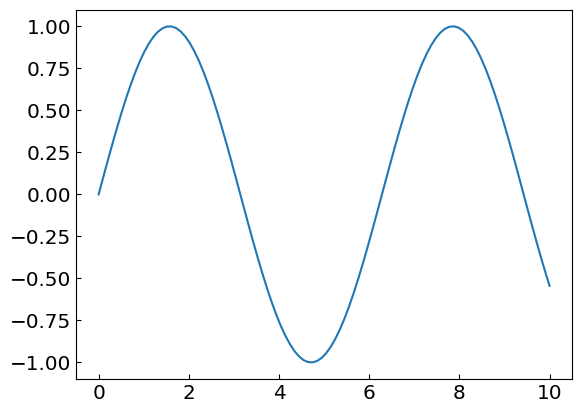
# Make a plot and show the results
plt.plot(x,y)
plt.show()
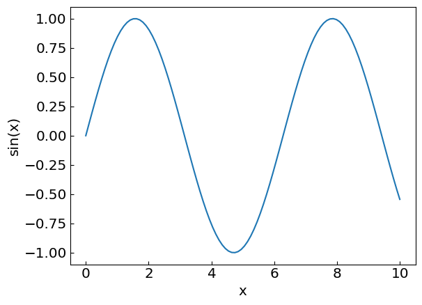
# Let us improve the presentation by adding the axis labels

plt.xlabel("x")
plt.ylabel("sin(x)")

plt.plot(x,y)
plt.show()
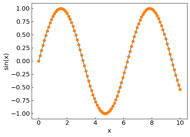
# By default the data points are connected by lines
# We can also plot the points themselves by using scatter style

plt.xlabel("x")
plt.ylabel("sin(x)")

# First the line plot
plt.plot(x,y)

# Then, the scatter plot
plt.plot(x,y,"o")
plt.show()
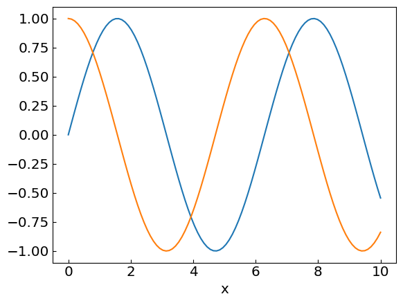
# Multiple plots
# Let us plot both sin(x) and cos(x)

numpoints = 100
x = linspace(0,10,numpoints)

# Calculate the value of sin(x) and each point and store in a list y
ysin = sin(x)
ycos = cos(x)

# Make a plot and show the results
plt.xlabel("x")
plt.plot(x,ysin)
plt.plot(x,ycos)
plt.show()
# Add a legend when there is more than one quantity plotted

plt.xlabel("x")
plt.plot(x, ysin, label = 'sin(x)')
plt.plot(x, ycos, label = 'cos(x)')
plt.legend()
plt.show()
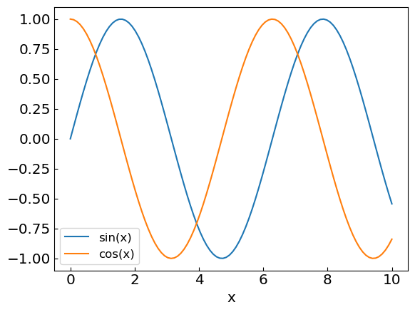
# Use different line styles

plt.xlabel("x")
plt.xlim(0,10)
plt.plot(x, ysin, label = 'sin(x)', linestyle = '-.')
plt.plot(x, ycos, label = 'cos(x)', linestyle = '--')
plt.legend()
plt.show()

Scatter plots#
In a scatter plot one places a dot for each (x,y) point in a data set
Useful for marking observations
For example the scatter plot the distribution of bright and surface temperature of stars (from Mark Newman’s book http://www-personal.umich.edu/~mejn/cp/chapters/graphics.pdf)
from numpy import loadtxt

# Load the star brightness-surface temperature pairs from file
data = loadtxt("stars.txt",float)

print(data)

x = data[:,0] # The first column from file

y = data[:,1] # The second column from file

print(x)
print(y)

plt.scatter(x,y, color = "blue", alpha = 0.25)

plt.xlabel("Temperature")
plt.ylabel("Magnitude")

plt.xlim(0,13000)
plt.ylim(-5,20)

plt.show()
[[ 6.83145085e+02  1.57300000e+01]
 [ 6.83145085e+02  1.70100000e+01]
 [ 1.01283217e+03  1.58600000e+01]
 ...
 [ 1.27621641e+04 -1.37000000e+00]
 [ 1.42023258e+04 -2.77000000e+00]
 [ 1.47860721e+04  1.04600000e+01]]
[  683.14508541   683.14508541  1012.83217289 ... 12762.1641452
 14202.3258475  14786.0720701 ]
[15.73 17.01 15.86 ... -1.37 -2.77 10.46]
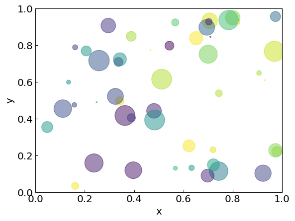
Another example: Render a scatter plot of a sample of uniformly distributed points inside a unit square (from matplotlib docs https://matplotlib.org/stable/gallery/shapes_and_collections/scatter.html#sphx-glr-gallery-shapes-and-collections-scatter-py)
import numpy as np

# Fixing random state for reproducibility
np.random.seed(19680801)
# np.random.seed(3)

N = 50
x = np.random.rand(N)
y = np.random.rand(N)

# Random color
colors = np.random.rand(N)

# Random size
area = (30 * np.random.rand(N))**2  # 0 to 15 point radii

plt.xlim(0,1)
plt.ylim(0,1)
plt.xlabel("x")
plt.ylabel("y")
plt.scatter(x, y, s=area, c=colors, alpha=0.5)
plt.show()
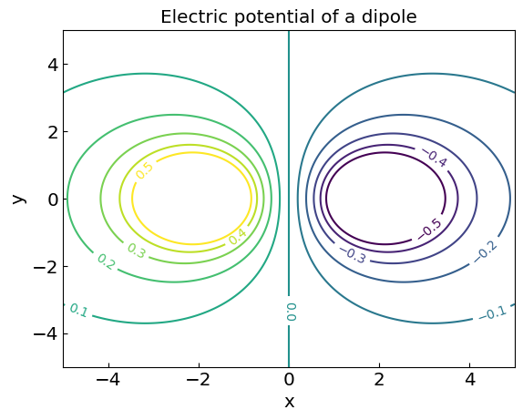
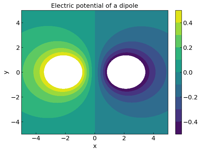
Contour/density plots#
Used to visualize two-dimensional data, namely two-dimensional functions \(f(x,y)\) such as fields
For example, the electric potential of a dipole reads (dimensionless units)
\(V_{dip} (x,y) = \frac{1}{\sqrt{(x-x_1)^2+(y-y_1)^2}} - \frac{1}{\sqrt{(x-x_2)^2+(y-y_2)^2}}\)
Here \((x_1,y_1)\) and \((x_2,y_2)\) are the coordinates of the poles
# Grid of points
x = np.linspace(-5,5,200)
y = np.linspace(-5,5,200)

# Meshgrid
X, Y = np.meshgrid(x, y)

# Locations of the poles
x1, y1 = -2., 0.
x2, y2 = 2., 0.

# Electric potential of a dipole
Vdip = 1./np.sqrt((X-x1)**2+(Y-y1)**2) - 1./np.sqrt((X-x2)**2+(Y-y2)**2)

# Contour plot (lines only)
plt.title("Electric potential of a dipole")
plt.xlabel("x")
plt.ylabel("y")
CS = plt.contour(X, Y, Vdip, levels = np.linspace(-0.5,0.5,11))
plt.clabel(CS)
plt.show()

# Density plot (filled)
fig2, ax2 = plt.subplots(constrained_layout=True)
ax2.set_title("Electric potential of a dipole")
ax2.set_xlabel("x")
ax2.set_ylabel("y")
CS2 = ax2.contourf(CS, levels = np.linspace(-0.5,0.5,11))
fig2.colorbar(CS2)

# Show the plot
plt.show()
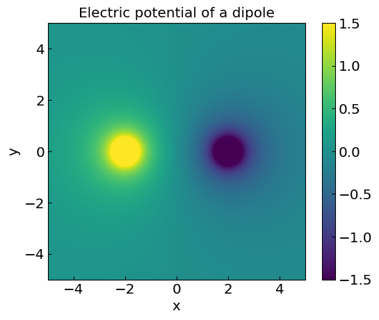
Density plot using imshow#
# Another example using imshow (good for interpolating colors)
plt.title("Electric potential of a dipole")
plt.xlabel("x")
plt.ylabel("y")
CS3 = plt.imshow(Vdip, vmax=1.5, vmin=-1.5,origin="lower",extent=[-5,5,-5,5])
plt.colorbar(CS3)
plt.show()
Animation#
Animations are fun! You can use matplotlib to create animations through the FuncAnimation class. Rendering can sometimes be tricky. Using IPython.display.HTML() can help with this.
Example#
Let us animate the motion of a projectile thrown at an angle \(\theta\) with initial velocity \(v_0\)
We have for the velocity \( v_x(t) = v_0 \cos(\theta) \) and \( v_y(t) = v_0 \sin(\theta) - gt \).
For the position coordinates $\( x(t) = v_0 \cos(\theta) t \)\( and \)\( y(t) = v_0 \sin(\theta) t - \frac{g t^2}{2} \)$
from IPython.display import HTML
import numpy as np
import matplotlib.pyplot as plt
import matplotlib.animation as animation

fig, ax = plt.subplots()

pos, = ax.plot(0,0,'o')
ax.set_xlim(0,1)
ax.set_ylim(-1,1)

v0 = 3.
theta = 60./180. * np.pi
g = 9.8

def pos_x(t):
    return v0 * np.cos(theta) * t

def pos_y(t):
    return v0 * np.sin(theta) * t - g*t**2/2.

dt = 0.01

l1x = [0]
l1y = [0]
line, = ax.plot(l1x,l1y)

total_frames = 70

def animate(frame):
    tx, ty = pos_x(frame*dt), pos_y(frame*dt)
    pos.set_data([tx], [ty])  # Wrap in lists to make them sequences
    if (len(l1x) < total_frames):
        l1x.append(tx)
    if (len(l1y) < total_frames):
        l1y.append(ty)
    line.set_data(l1x, l1y)
    return pos, line  # Return the artists that were modified

anim = animation.FuncAnimation(
   fig=fig, func=animate, frames = total_frames, interval=30)
plt.close()
HTML(anim.to_jshtml())
Further reading#
Mark Newman’s Computational Physics textbook: chapters/graphics.pdf
3D animations in Jupyter with vPython
Animations and interactive plots with pygame